Blue Rock

For presentation only

Case Study


BlueROCK is a technology and business solutions firm that provides enterprise software, custom development, data analytics, AI/ML, automation, security, compliance, cloud services, and business strategy. They specialize in transforming complex business challenges into opportunities by delivering tailored technical solutions.


The Challenge


BlueROCK’s brand no longer reflected their expertise. Their website was difficult to navigate, lacked engaging content, and failed to communicate their value to clients and recruits. While they provided cutting-edge technology solutions, their digital presence told a different story.

A major issue was their logo. Clients often joked that it looked like the mountain graphic on a Coors Light can—a comparison that, while harmless, didn’t align with their professional image. They needed a logo that felt intentional, modern, and uniquely theirs. Beyond visuals, they required a cohesive brand identity that worked across digital, print, and promotional materials, along with a website that better showcased their services and attracted top talent.


The Solution


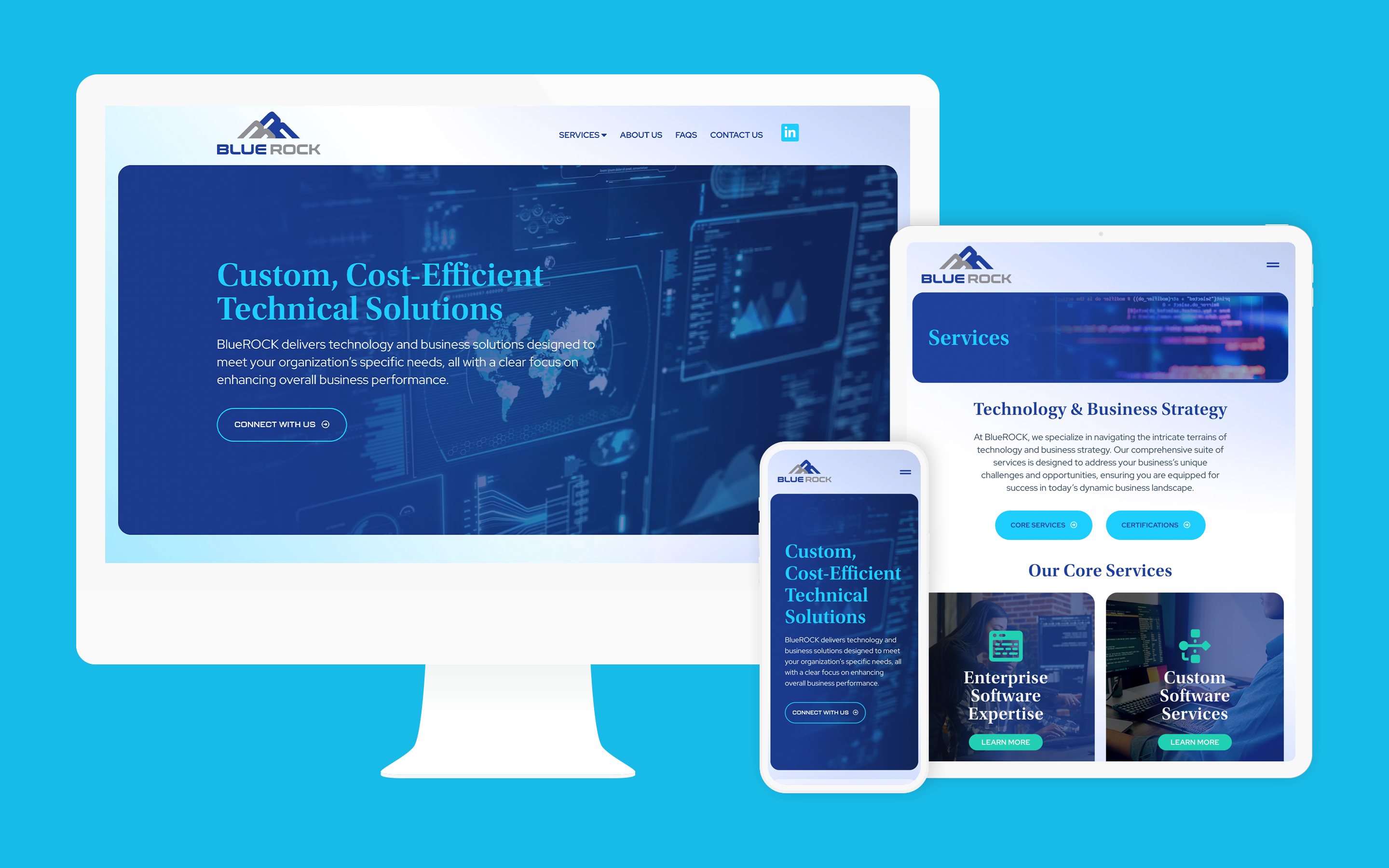
We started with an in-depth brand audit, interviewing stakeholders and using our targeted questionnaire to gather key insights. This allowed us to clarify BlueROCK’s brand identity and create a strategic framework for their visual presence. Alongside this, we performed a heuristic evaluation of their existing website to identify usability issues and structural improvements, ensuring that the new site would be both functional and engaging.

The new custom logo moved away from any unintended associations and instead reinforced BlueROCK’s core values of stability and reliability. The design subtly integrates the initials “B” and “R” within a mountain-inspired structure, symbolizing strength, growth, and a solid foundation. The website was built with a sleek, tech-forward aesthetic, aligning with their industry while maintaining an intuitive user experience. The site now effectively showcases their expertise, serves as a recruitment tool, and provides a consistent brand experience across digital and print materials.

Project Details

  • Logo Design
  • Brand Guidelines
  • Web Design
  • Web Development
  • Heuristic Evaluation
  • Content Strategy
  • Social Media Graphics
  • Marketing Collateral
  • Website Hosting
  • Website Care Plan
For presentation only
This is a sample image

Brand Strategy

NOLHGA’s new logo was designed to visually represent its core mission—protection, stability, and unity. At its heart is a cube within a cube, symbolizing the multiple layers of security the organization provides. The inner cube represents policyholders, safeguarded by the outer layers, which represent the state guaranty associations ensuring their protection. A subtle “N” is integrated into the structure, reinforcing NOLHGA’s role as the unifying force that holds these protective layers together.

The color palette was chosen to evoke trust, stability, and reassurance, aligning with the organization’s mission of providing a dependable safety net. The geometric structure conveys strength and resilience, reflecting NOLHGA’s long-standing commitment to policyholders and the insurance industry. This design not only modernizes their identity but also creates a clear, meaningful visual representation of their role in safeguarding consumers.

This is a sample image

Process

Add a brief insight into the process here. Wireframes, sketches, heuristics. Show different parts of the experiences for each client. This can detail UX and Strategy for Contant as well as Big Data. Other may just be brand related, etc.

This is a sample image

Working with Scott and Michele was a game-changer. They took our outdated site and completely transformed it into a modern, intuitive platform that truly reflects who we are. The new logo perfectly captures our mission of protection and stability, and the structured layers visually reinforce what we do every day. From organizing our vast data to creating a seamless experience for our members and policyholders, Blend delivered beyond our expectations. The new site is not just a redesign—it’s a powerful tool for our organization’s future.


– Senior Management at Blue Rock

Results

Since launching the new branding and website, BlueROCK has seen increased engagement across digital platforms, with stronger recognition in their industry. Their new visual identity has reinforced trust with existing clients while making a strong impression on prospective customers and recruits. The website now serves as a central hub for their services, improving how they communicate their expertise and connect with potential hires. The success of this project also led to a referral to their sister company, allowing us to continue building upon the brand’s momentum. With a professional and unified brand, BlueROCK is now positioned to confidently engage both clients and future employees.

88%

Lorem ipsum dolor sit amet con sectetur adipiscing elit anteque.

123

Lorem ipsum dolor sit amet con sectetur adipiscing elit anteque.

12%

Lorem ipsum dolor sit amet con sectetur adipiscing elit anteque.

Before / After

Show before a before and after graphic of website and/or logo.

This is a sample image

Contact Info

We are unapologetically human—our process, is rooted in design thinking, not AI. It’s this intentional approach that enables us to create work that feels alive, personal, and unforgettable.